Why design matters
Your data deserves better than defaults
The difference between a report that gets ignored and one that drives decisions.
Drag the slider to compare
That's how long executives take to form an opinion about your report. Make every second count.
A complete design system for Power BI
Templates, themes, icons, and UX patterns — designed to work together.
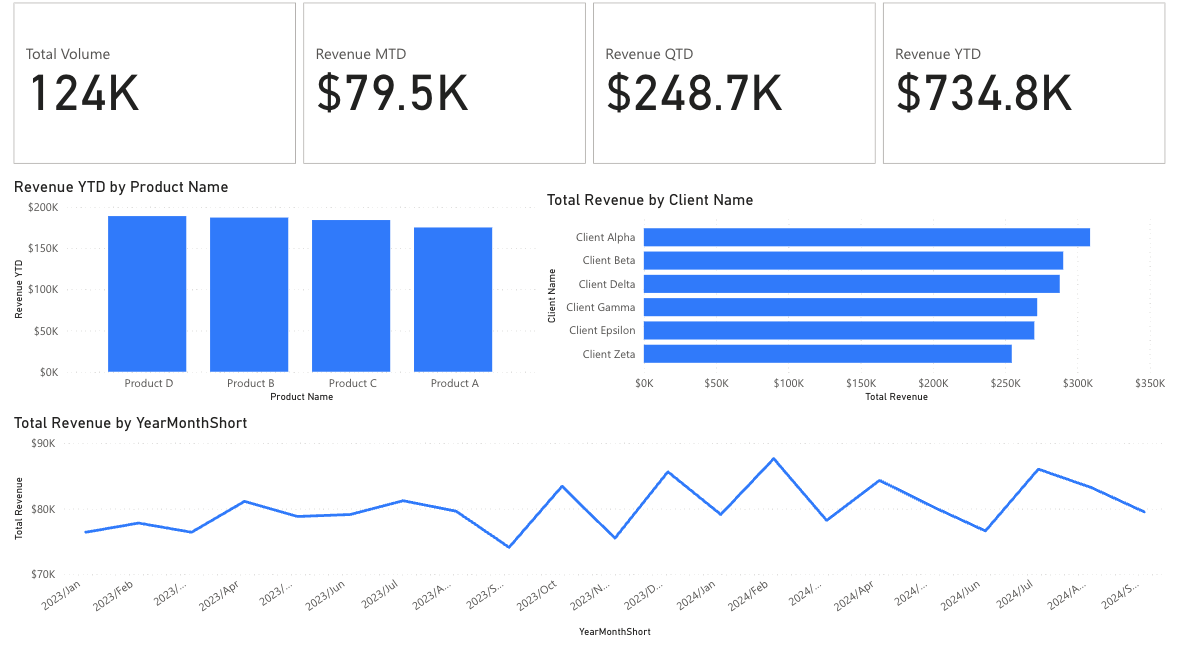
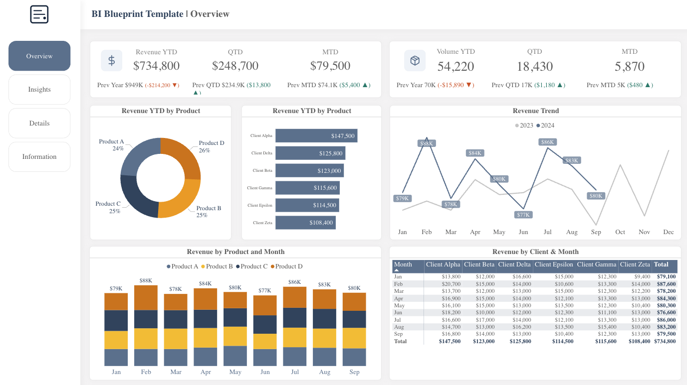
Start with executive-ready layouts
Pre-built dashboard pages with KPIs, trends, and drill-through patterns.
Apply a matching theme in minutes
Use the Theme Generator to match your brand colors.
Use icons and UX patterns for consistency
Create custom KPI icons with the Icon Generator.
Explore the design system
5 principles of effective dashboards
First impressions are decisions
Executives form opinions in seconds. A polished dashboard signals competence before anyone reads a number. When your report looks professional, your analysis gets the attention it deserves.
Which would you trust more?
Confusing Nav
Clear Nav
Navigation isn't optional
When users can't find what they need, they stop using the report. Consistent navigation means they learn once and never get lost. Your reports become self-service instead of support tickets.
Consistency builds trust
When every report looks different, users waste mental energy re-learning the interface. A design system lets them focus on the data, not the dashboard. The report fades into the background, and insights take center stage.
Inconsistent Reports
Consistent Design System
Design reduces questions
Good dashboards answer questions before they're asked. Clear labels, logical groupings, and visual hierarchy guide users to answers. Fewer Slack messages. Fewer walkthrough meetings. More time for analysis.
Your time has value
Every hour spent tweaking layouts is an hour not spent on analysis. You were hired for your analytical skills, not your design skills. Start with a system that handles the presentation.
Time saved = more time for actual analysis
The result: reports that work
Impress stakeholders
Professional reports build credibility with executives and clients. Your work gets the attention it deserves.
Ship faster
Pre-built layouts mean you spend time on data, not design decisions. Go from data to dashboard in hours, not days.
Scale your style
Apply the same polished look across every report you create. Build a recognizable brand for your analytics.
Give your reports the polish they deserve
Stop wrestling with layouts and start delivering insights. BI Blueprint gives you the professional foundation your work deserves.
Get Template — $69One-time purchase • Includes PBIX, theme file, and docs